Building components in React is always a rewarding experience, especially when the result is sleek, reusable, and visually impressive. Today, I’ll walk you through creating a progress bar in React that is always 100% wide, with a dynamic background that visually represents progress through a transparent effect on the right.
Thank me by sharing on Twitter 🙏
We’ll use CSS and TypeScript to make the component highly customizable and easy to integrate into any project. By the end, you’ll have a progress bar that not only works well but also looks stunning.
Understanding the Requirements
Progress bars are a staple UI element in modern web applications. Whether you’re displaying file uploads, completion percentages, or any other type of progress, a clean design goes a long way toward improving user experience. For this project, the requirements are:
- The progress bar should always be 100% wide.
- The background should dynamically adjust based on progress.
- The filled portion of the bar will be a solid color, while the remaining portion will appear transparent.
We’ll handle the layout with CSS and use React props to make the progress percentage dynamic.
Step 1: Setting Up the Component
We start by creating a React component in TypeScript. The first step is to define the structure of our TransparentBar component.

Apple 240W USB-C to USB-C Woven Charge Cable (2 m): Fast and Convenient Charging
$24.99 (as of October 22, 2025 00:51 GMT +00:00 - More infoProduct prices and availability are accurate as of the date/time indicated and are subject to change. Any price and availability information displayed on [relevant Amazon Site(s), as applicable] at the time of purchase will apply to the purchase of this product.)
Vibe Coding: Building Production-Grade Software With GenAI, Chat, Agents, and Beyond
$16.99 (as of October 23, 2025 18:10 GMT +00:00 - More infoProduct prices and availability are accurate as of the date/time indicated and are subject to change. Any price and availability information displayed on [relevant Amazon Site(s), as applicable] at the time of purchase will apply to the purchase of this product.)
SanDisk 128GB Extreme PRO SDXC UHS-I Memory Card - C10, U3, V30, 4K UHD, SD Card - SDSDXXD-128G-GN4IN
$23.99 (as of October 22, 2025 00:51 GMT +00:00 - More infoProduct prices and availability are accurate as of the date/time indicated and are subject to change. Any price and availability information displayed on [relevant Amazon Site(s), as applicable] at the time of purchase will apply to the purchase of this product.)import React from "react";
import "./TransparentBar.css";
interface TransparentBarProps {
percentage: number;
}
const TransparentBar: React.FC<TransparentBarProps> = ({ percentage }) => {
return (
<div
className="bar-container"
style={{
"--filled-percentage": `${percentage}%`,
} as React.CSSProperties}
></div>
);
};
export default TransparentBar;
Here’s what’s happening:
- We define a
percentageprop, typed as anumber. - We use the
styleattribute to dynamically set a CSS custom property,--filled-percentage, which we’ll use in our CSS file. - The
classNamepoints to a CSS class we’ll define next to style the bar.
By keeping the logic minimal in the React component and offloading the styling to CSS, we achieve a clean separation of concerns.
Step 2: Crafting the CSS
The magic of this progress bar lies in its CSS. With a 100% wide div, the background dynamically adjusts using a linear-gradient to achieve the solid-to-transparent effect.
.bar-container {
  width: 100%;
  height: 30px; /* Adjust height as needed */
  background: linear-gradient(
    to right,
    blue var(--filled-percentage, 0%),
    transparent var(--filled-percentage, 0%)
  );
  border: 1px solid #000; /* Optional: for visibility */
  position: relative;
}
Let’s break this down:
- Dynamic Gradient: The
linear-gradienttransitions from a solid color (blue) totransparent. Thevar(--filled-percentage)value determines the point where the transition occurs. - CSS Custom Property: The
--filled-percentagevariable makes it easy to control the gradient from the React component. - Responsive Design: The width is always set to
100%, so it spans the full width of the container, regardless of the screen size.
Step 3: Integrating the Component
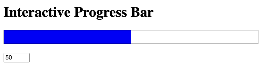
Once the component and styles are in place, it’s time to use the TransparentBar in a parent component. Here’s an example where users can interactively update the progress:
import React, { useState } from "react";
import TransparentBar from "./TransparentBar";

const App: React.FC = () => {
  const [progress, setProgress] = useState<number>(50);

  const handleInputChange = (event: React.ChangeEvent<HTMLInputElement>) => {
    const value = Math.min(100, Math.max(0, parseInt(event.target.value, 10)));
    setProgress(value);
  };

  return (
    <div>
      <h1>Interactive Progress Bar</h1>
      <TransparentBar percentage={progress} />
      <input
        type="number"
        value={progress}
        onChange={handleInputChange}
        style={{ marginTop: "20px", width: "50px" }}
      />
    </div>
  );
};

export default App;
In this example:
- We use a state variable
progressto control the bar’s percentage. - An input field allows the user to set the progress value dynamically, with clamping logic to ensure the value stays between 0 and 100.
- The
TransparentBarupdates automatically as the state changes.
Step 4: Enhancing with Accessibility
A good progress bar should not only look great but also be accessible to all users. Adding an aria-label and other accessibility features ensures compatibility with screen readers.
Here’s an updated version of our TransparentBar component:
const TransparentBar: React.FC<TransparentBarProps> = ({ percentage }) => {
  return (
    <div
      className="bar-container"
      style={{
        "--filled-percentage": `${percentage}%`,
      } as React.CSSProperties}
      role="progressbar"
      aria-valuenow={percentage}
      aria-valuemin={0}
      aria-valuemax={100}
    ></div>
  );
};
These additional attributes communicate the current progress state to assistive technologies, making the component more inclusive.
Step 5: Customizing the Appearance
One of the benefits of this approach is how easy it is to customize. For instance, changing the color or height of the bar is as simple as modifying the CSS.
To change the bar’s color dynamically based on the percentage, you can extend the logic:
.bar-container {
  background: linear-gradient(
    to right,
    var(--bar-color, blue) var(--filled-percentage, 0%),
    transparent var(--filled-percentage, 0%)
  );
}
Then, pass the color as a prop and include it in the inline styles:
interface TransparentBarProps {
  percentage: number;
  color?: string;
}

const TransparentBar: React.FC<TransparentBarProps> = ({ percentage, color = "blue" }) => {
  return (
    <div
      className="bar-container"
      style={{
        "--filled-percentage": `${percentage}%`,
        "--bar-color": color,
      } as React.CSSProperties}
    ></div>
  );
};
Now you can customize the bar color like so:
<TransparentBar percentage={75} color="green" />
Conclusion
By combining React’s dynamic capabilities with the power of CSS, we’ve created a progress bar that’s both functional and visually appealing. The use of CSS custom properties makes the component highly reusable and easy to style, while TypeScript ensures type safety and better maintainability.
This approach strikes a balance between simplicity and flexibility, allowing you to integrate the progress bar into any project effortlessly. Whether you’re building a dashboard, an interactive form, or a user feedback interface, this transparent bar design is sure to enhance the user experience.
View the CodeSandbox


